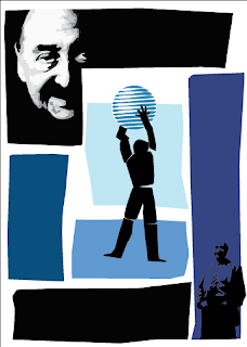
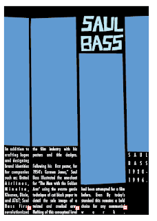
 More votes went to blue, so it is now the declared winner. (I'll have to produce an orange one as well for the sake of it)
This is my "Final" design. I put final in quotes because there is no possible way for me to open this file again and see some things I want to change. So I'll be opening it and closing it for the next day or so steadily.
Things changed from the last one include the font on the back: After I changed the font slightly I found I didn't have any room for stars in the first place (as was in my first design), I don't miss them. I fixed the (intentionally) crooked arm on the front so it intersects with the AT&T logo better. The logo got re-drawn, and I ended up liking the original better, then it was rotated counter-clockwise a bit. Shrank the center figure some and moved him around. Small Saul in the bottom corner ended up staying (I toyed with taking him out but it f'd with the composition too much for right now), but he got cleaned up and had some color removed -- big Saul got a touch up or two also.
 All in all I had a great bit of fun with this assignment, I felt it was an important one from the get-go. When you do anything it's important to see what people who came before you did. It's great exercise breaking down other's work and to reinterpret it into your own, the same way a painting student would be required to reproduce a classic painting by one of the old masters.
1 comment:
hey quin!
oh PLEASE, please please please update your blog :) process, tutorials, your writing...it will all be good - I swear!
Post a Comment