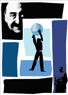
More votes went to blue, so it is now the declared winner. (I'll have to produce an orange one as well for the sake of it)
This is my "Final" design. I put final in quotes because there is no possible way for me to open this file again and see some things I want to change. So I'll be opening it and closing it for the next day or so steadily.
Things changed from the last one include the font on the back: After I changed the font slightly I found I didn't have any room for stars in the first place (as was in my first design), I don't miss them. I fixed the (intentionally) crooked arm on the front so it intersects with the AT&T logo better. The logo got re-drawn, and I ended up liking the original better, then it was rotated counter-clockwise a bit. Shrank the center figure some and moved him around. Small Saul in the bottom corner ended up staying (I toyed with taking him out but it
f'd with the composition too much for right now), but he got cleaned up and had some color removed -- big Saul got a touch up or two also.
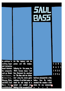
All in all I had a great bit of fun with this assignment, I felt it was an important one from the get-go. When you do anything it's important to see what people who came before you did. It's great exercise breaking down other's work and to
reinterpret it into your own, the same way a painting student would be required to reproduce a classic painting by one of the old masters.


 More votes went to blue, so it is now the declared winner. (I'll have to produce an orange one as well for the sake of it)
 All in all I had a great bit of fun with this assignment, I felt it was an important one from the get-go. When you do anything it's important to see what people who came before you did. It's great exercise breaking down other's work and to reinterpret it into your own, the same way a painting student would be required to reproduce a classic painting by one of the old masters.
 He conveys the story in such a beautiful and symphonic way that hadn't been attempted before. It would be rare to find a poster this daring today even.
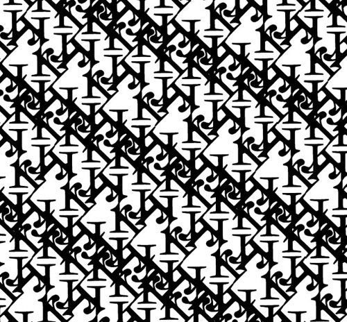
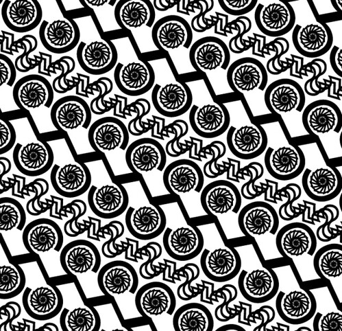
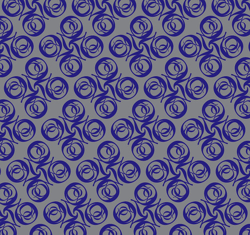
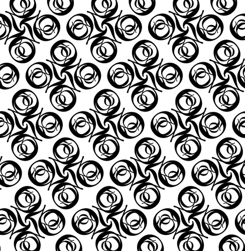 Here's my series of typographic patterns for revelry and enjoyment. Let's start with Baskerville 'Q'
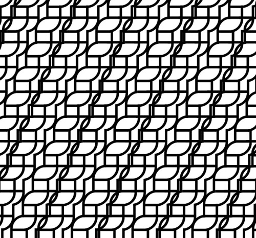
 First, I had a line I wanted to cut down (that'd be the main entrance, smack in the center of the page).
 Using the Scissors I clicked the two points that I had created. This separates it into it's own line but doesn't delete it, so that's all that's left for me to do.
 Delete and viola!

 Slicing and cutting is not something I've never used before but I'm sure I'll need it. It's definitely looks like it'll save me some trouble in the future.
 Live Paint looked like something I'd use too, but again the help page makes it seem much more daunting than it is. I reviewed these on a machine without illustrator, so I'll have to go back and experiment to get any real knowledge from this.

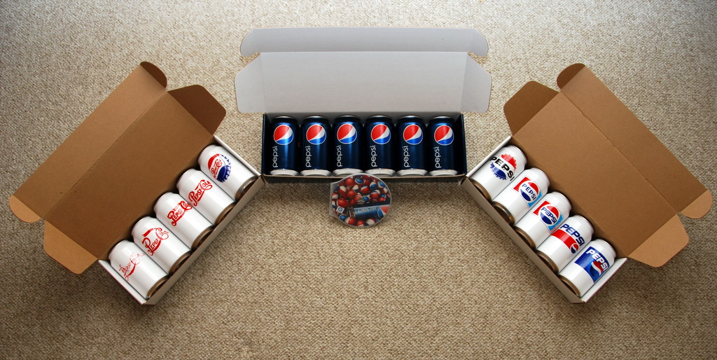 Here I found a picture of one of the promotions for the unveiling of the new design (thanks to the Brand New website). These cans represent the changing logo over the years. None of these white cans were produced for the market, which is unfortunate because I find the white cans have far more fun and interesting designs to them.
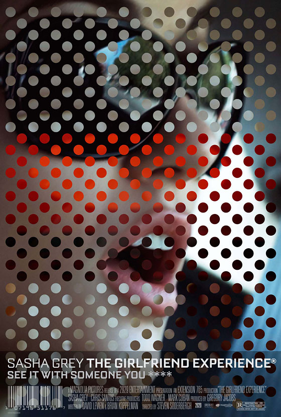 I'm staring and staring and I can't tell what image, if any is used to make up these dots...
 I love this print by Guy Burwell, I encountered it in a McMenamins, it was originally for a Decemberists concert at the Crystal Ballroom some years ago.