Tuesday, April 7, 2009

Found Design #δΊ”


I've run out of things I loved this week, so I typed in "awesome graphic design" in Google to see things other people on the 'net had liked. What I got was a mish-mash of randomness (as was to be expected) and an intriguing/creepy image of a gigantic spider and a woman having intercourse in a Playboy style spread (I won't be linking to it because that just wrong, plus I'm afraid of spiders). After much searching, I found this:


Cute and unoffensive, crocheted food (and other characters by Nicole Gastonguay. Seriously, something you don't see everyday. Excellent use of googly eyes (if they had put those on that gigantic effing spider it would have been less scary, "the eyes are the windows of your face").
What do you think? Any good? Is this art? (ooh controversy)

Found Design #Quattro

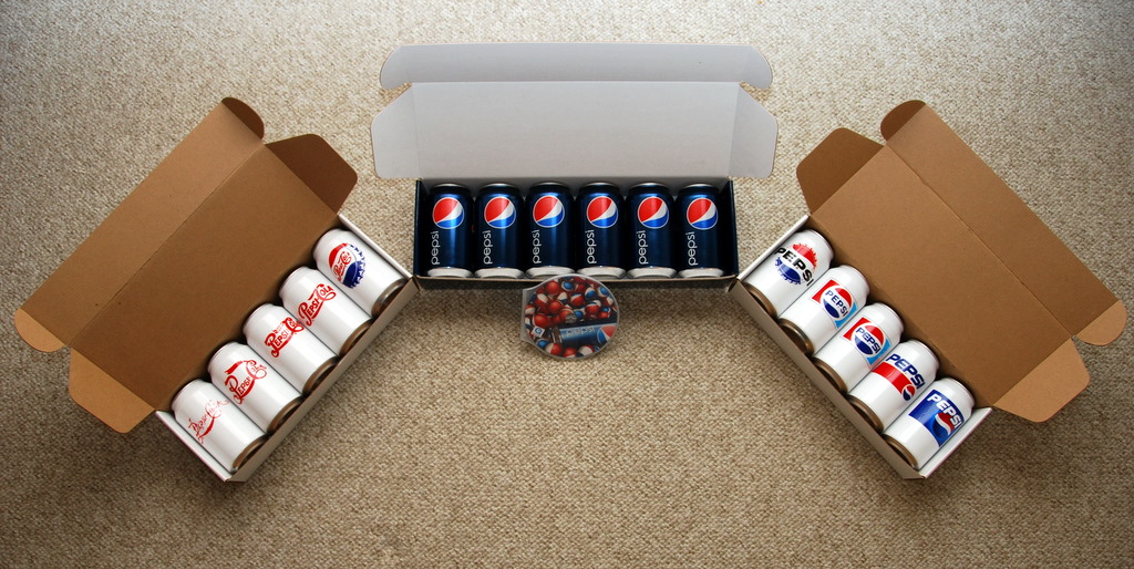
I'm a Coke guy myself (the drink not the illegal narcotic), but I came across the new Pepsi 24 packs (they look better than the 12) at the store and was drawn to the simplicity of the new packaging. No slogans or catchphrases, no subliminal sex messages, no words (save for "Pepsi"); just a logo and lots of blue. Granted I hate the new a-symetrical "sailboat" logo, but I appreciate the minimalist use of the logo against a solid background, and that solid background pops out against the busy and loud ("eXtreme!") grocery store shelf.
Here I found a picture of one of the promotions for the unveiling of the new design (thanks to the Brand New website). These cans represent the changing logo over the years. None of these white cans were produced for the market, which is unfortunate because I find the white cans have far more fun and interesting designs to them.
Anybody have a favorite can and why?

Found Design #San

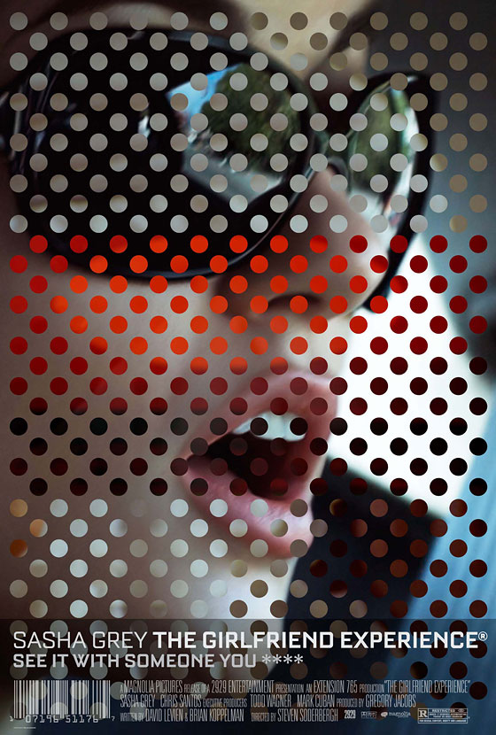
I'm staring and staring and I can't tell what image, if any is used to make up these dots...
That streak of red through the center amazes me how it can be attention grabbing without distracting. I love the play with warm and cool colors, how it grounds that background and enhances the contrast and keeps the image readable the image. I love everything especially that bar code.

This movie poster for Steven Soderbergh's The Girlfriend Experience has popped up a number of places since being premiered online by New York Magazine last week. (the author neglects to give the designers credit)

Found Design #Deux


Here's a fun one that came out of the April 2nd edition of the Portland Mercury. Designer Unknown (I checked around, nothing...).

I almost mistook this for a genuine 50's B-movie flick, save for the computer-made typeface and high-res quality of the photos (they reduced the photo quality to give it a dated feel, just not enough). The painted saucer and alien eye really solidify the thematic purpose here. All-in-all I really enjoyed this exercise in recreating camp.
Movie Site

Monday, April 6, 2009

Found Design #Uno

I love this print by Guy Burwell, I encountered it in a McMenamins, it was originally for a Decemberists concert at the Crystal Ballroom some years ago.

I'm really drawn to the organic quality given to house (with the curves and gray tones adding a sheen), reinforced by the leaves swirling about, and tempered with the mechanical nature of the mushroom shaped head.

Thursday, April 2, 2009

My Info

Computer Experience: I've only owned a computer for a little over a year now, and have been working diligently in learning everything I could regarding graphics. I've taken one class in Digital Media (ART 119) and am mostly self taught. I use a co-workers machine, that is loaded with a complete CS3 package, after hours.

What I'm Excited About: I try not to show excitement...

Favorite Books: I really stopped reading anything outside of school when I started.

Favorite Website: As a graphics and movie nerd I enjoy the Imp Awards site. They display most every new poster, and judge them at the end of the year. Also included in the site is a nice feature where you can sort posters by design firm.

ART 120

THIS IS NO LONGER THE "CITY IN FILM" BLOG,
IT IS NOW ART 120...