Tuesday, April 21, 2009

Winner Goes to Blue

More votes went to blue, so it is now the declared winner. (I'll have to produce an orange one as well for the sake of it)


This is my "Final" design. I put final in quotes because there is no possible way for me to open this file again and see some things I want to change. So I'll be opening it and closing it for the next day or so steadily.


Things changed from the last one include the font on the back: After I changed the font slightly I found I didn't have any room for stars in the first place (as was in my first design), I don't miss them. I fixed the (intentionally) crooked arm on the front so it intersects with the AT&T logo better. The logo got re-drawn, and I ended up liking the original better, then it was rotated counter-clockwise a bit. Shrank the center figure some and moved him around. Small Saul in the bottom corner ended up staying (I toyed with taking him out but it f'd with the composition too much for right now), but he got cleaned up and had some color removed -- big Saul got a touch up or two also.


All in all I had a great bit of fun with this assignment, I felt it was an important one from the get-go. When you do anything it's important to see what people who came before you did. It's great exercise breaking down other's work and to reinterpret it into your own, the same way a painting student would be required to reproduce a classic painting by one of the old masters.

Monday, April 13, 2009

History of Graphic Design

It seems I got a mad-on for movie posters so I felt it natural to gravitate towards Saul Bass, a formidable figure in the history of design who revolutionized film through posters and credits.

I've always been a fan of the one-sheet for Alfred Hitchcock's "Vertigo," but it wasn't until a year or so ago that I realized the true strength of the work and the person behind it.
He conveys the story in such a beautiful and symphonic way that hadn't been attempted before. It would be rare to find a poster this daring today even.

type-O-rama

Here's my series of typographic patterns for revelry and enjoyment. Let's start with Baskerville 'Q'






Next is Busorama 'F'


Followed closely by Garamond 'r'


Here we have Futura '5'


Finally let's add some color


That's better, a hell of alot less difficult to look at. The others just didn't work as well with color so this is all we get.

Using the Scissor Tool

Here I've gone off and used the scissor tool for the first time (of course this is after discovering what wouldn't work -- your time will come slice tool!).
PICTURES ARE CLICKABLE

First, I had a line I wanted to cut down (that'd be the main entrance, smack in the center of the page).
Then, I added points to my line with the Pen tool, using the one with the plus, placing them in the spots where I wanted the line to stop and start.
Using the Scissors I clicked the two points that I had created. This separates it into it's own line but doesn't delete it, so that's all that's left for me to do.
Delete and viola!

Thursday, April 9, 2009

Adobe Livedocs

I started by checking out the Pen Tool help, then I realized that I'd already read it as it is completely impossible to ever have used the Pen Tool and not have to look at the help page.

Then it was on to Live Trace, Live Trace fascinated me (and still does), I am anxious to find the time to try it out (and make color photos look like a Bi-Mart ad). The video tutorial wasn't bad (a robot with tentacles though, really?)

I thought alignment was a good one to check out because I had some problems with it recently. We'll see if it helps.
Slicing and cutting is not something I've never used before but I'm sure I'll need it. It's definitely looks like it'll save me some trouble in the future.


Pathfinder seems from reading the Livedoc to be a bit overwhelming and complicated but once I found some pictures It made some sense. It was here that I realized the general lack of visual aide in Livedocs (one per tool or so). Mildly ironic given the topic.
Live Paint looked like something I'd use too, but again the help page makes it seem much more daunting than it is. I reviewed these on a machine without illustrator, so I'll have to go back and experiment to get any real knowledge from this.

Tuesday, April 7, 2009

Jim Datz' writing on patterns...

Quite frankly his flowery adjectives made me feel illiterate. What a perfect way to show pretentiousness in graphic design. After throwing-up in my mouth repeatedly from words like "chromophile" I found there was an actual purpose for writing. Boiling it down there are four key points:
1. Patterns are everywhere.
2. Graphic Designers need to be able to digest and regurgitate designs and patterns.
3. We experience things differently now than in previous generations.
4. Because of this styles change and grow more rapidly.

Consider me blown away...
Note: on closer examination the Jim Datz' "lexiphilia" did help me as, as a Graphic Designer, to regurgitate.

Found Design #五


I've run out of things I loved this week, so I typed in "awesome graphic design" in Google to see things other people on the 'net had liked. What I got was a mish-mash of randomness (as was to be expected) and an intriguing/creepy image of a gigantic spider and a woman having intercourse in a Playboy style spread (I won't be linking to it because that just wrong, plus I'm afraid of spiders). After much searching, I found this:


Cute and unoffensive, crocheted food (and other characters by Nicole Gastonguay. Seriously, something you don't see everyday. Excellent use of googly eyes (if they had put those on that gigantic effing spider it would have been less scary, "the eyes are the windows of your face").
What do you think? Any good? Is this art? (ooh controversy)

Found Design #Quattro

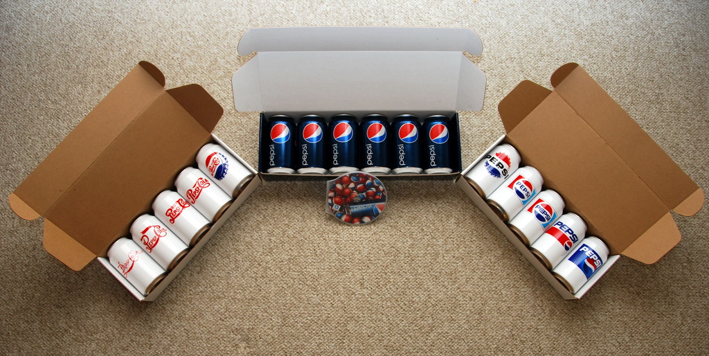
I'm a Coke guy myself (the drink not the illegal narcotic), but I came across the new Pepsi 24 packs (they look better than the 12) at the store and was drawn to the simplicity of the new packaging. No slogans or catchphrases, no subliminal sex messages, no words (save for "Pepsi"); just a logo and lots of blue. Granted I hate the new a-symetrical "sailboat" logo, but I appreciate the minimalist use of the logo against a solid background, and that solid background pops out against the busy and loud ("eXtreme!") grocery store shelf.
Here I found a picture of one of the promotions for the unveiling of the new design (thanks to the Brand New website). These cans represent the changing logo over the years. None of these white cans were produced for the market, which is unfortunate because I find the white cans have far more fun and interesting designs to them.

Anybody have a favorite can and why?

Found Design #San

I'm staring and staring and I can't tell what image, if any is used to make up these dots...
That streak of red through the center amazes me how it can be attention grabbing without distracting. I love the play with warm and cool colors, how it grounds that background and enhances the contrast and keeps the image readable the image. I love everything especially that bar code.

This movie poster for Steven Soderbergh's The Girlfriend Experience has popped up a number of places since being premiered online by New York Magazine last week. (the author neglects to give the designers credit)

Found Design #Deux


Here's a fun one that came out of the April 2nd edition of the Portland Mercury. Designer Unknown (I checked around, nothing...).

I almost mistook this for a genuine 50's B-movie flick, save for the computer-made typeface and high-res quality of the photos (they reduced the photo quality to give it a dated feel, just not enough). The painted saucer and alien eye really solidify the thematic purpose here. All-in-all I really enjoyed this exercise in recreating camp.
Movie Site

Monday, April 6, 2009

Found Design #Uno

I love this print by Guy Burwell, I encountered it in a McMenamins, it was originally for a Decemberists concert at the Crystal Ballroom some years ago.

I'm really drawn to the organic quality given to house (with the curves and gray tones adding a sheen), reinforced by the leaves swirling about, and tempered with the mechanical nature of the mushroom shaped head.

Thursday, April 2, 2009

My Info

Computer Experience: I've only owned a computer for a little over a year now, and have been working diligently in learning everything I could regarding graphics. I've taken one class in Digital Media (ART 119) and am mostly self taught. I use a co-workers machine, that is loaded with a complete CS3 package, after hours.

What I'm Excited About: I try not to show excitement...

Favorite Books: I really stopped reading anything outside of school when I started.

Favorite Website: As a graphics and movie nerd I enjoy the Imp Awards site. They display most every new poster, and judge them at the end of the year. Also included in the site is a nice feature where you can sort posters by design firm.

ART 120

THIS IS NO LONGER THE "CITY IN FILM" BLOG,
IT IS NOW ART 120...

Tuesday, March 11, 2008

Chicago: y'know like New York for the working class

Chicago’s always seemed the tougher street-smart little brother to New York. Like all little brothers this ones always vying to be number one (in size, economically, or even in measurement [think Sears Tower]). Located in Illinois it never had the advantage of being neither the immigration epicenter nor a major export hub that’s vital for any large city, Chicago’s had to work for its status. The Fugitive and High Fidelity present two very different views of Chicago. The main characters represent different economic classes but illustrate the spread of working class, and that's Chicago's place, representing the working class.


The Fugitive’s main character of Dr. Richard Kimble represents the more affluent side of Chicago, but while living in luxury, he doesn’t get a mcmansion the style of L.A. The rich houses of Chicago are stacked together like any suburb row. The middle class demographic is represented in High Fidelity. However, John Cusack’s character of a record store owner Rob lives in an apartment that even he refers to as “dump." (Apparently Rob lives in the same apartment as Sandra Bullock [While You Were Sleeping]) The higher cost of living it seems to homogenize the class levels into living in basic similar ways, meaning there isn’t as great a contrast in lifestyles as in some cities (e.g. L.A.).


The unemployment rate in Chicago fluctuates greatly but it has the benefit of a balanced economy. With the diversification of the workforce Chicago will always have a base sufficient level of jobs, and enough jobs to maintain different economic levels (unlike say Detroit). High Fidelity’s story revolves around this privately-owned record store that shows the “mom and pop” shop still exists but through the main characters words (“maybe I should close down and just manage a Virgin mega store”) we know that private business is still under threat of being taken over by big business.


The characters in these movies work constantly. Harrison Ford’s character of Richard Kimble never stops working, even while he’s on the run from the police. Before becoming the aforementioned Fugitive we see that he can’t go home to an evening with his wife after a work banquet, instead he gets called into work for the duration of the evening and that it’s not uncommon. John Cusack’s Rob the record store owner works every day. Near the end of the film he realizes that he needs to work more to break free of his rut in life. These are people who work for everything they have, and they work hard.


Regardless of the fact that Chicago is one of the richest cities in the world it is never been glamorized as such. I have yet to see a film about the richest family in Chicago, and it makes sense, after all if I were rich I’d be in New York or California. California has its slackers, New York has its playboys (or girls), and Chicago has a workforce.

Monday, February 18, 2008

Paradise Lost (then Found, then Lost Again): San Francisco in Film


People will cry “bullshit!” if you don’t have a shot of the Golden Gate Bridge in a San Francisco film. This enormous incandescent structure represents the whole of the Bay Area. With its’ orange veneer the Golden Gate balances its’ industrial 30’s deco with a beautiful charismatic surface. For the past 150 years San Francisco has attempted to maintain its’ beauty against modernization. It’s this beauty that makes San Francisco a unique location for films of intrigue.


Gorgeous vistas decorate Vertigo’s interior scenes, whether it is a trip to the Palace of Fine Arts or merely down the sloped streets of San Francisco. Hitchcock uses the serene settings as contrast to enhance the drama of the later scenes. He loved to build tension in the audience’s unease over the idea that something big can happen at anytime. Director David Fincher does much the same affect in Zodiac. When two day-trippers on a picnic by a lake, gorgeous and serene, are brutally murdered, Fincher sends the message, “I don’t care how pretty it is, you are no longer safe in this movie.”


Darkness enshrouds San Francisco in both films. Not surprising though is Zodiac's serial killer tale takes place almost exclusively at night. A perfect device for suspense, darkness gives us the feeling of a character’s being vulnerable, anyone can be lurking in the shadows. Vertigo begins and ends just before sunrise, darkness is used sparingly. When it is used it’s a tool to illustrate Jimmy Stewart’s vulnerability; both its’ origin and when he must drastically overcome it.


The whole visage of Vertigo dims as the film progresses (even after restoration). The theme being as the film progresses the story becomes more glooming and depressing, as such the film’s color and look adapts with it. The same can be said for Zodiac, this time the director introduces rain and other natural elements as thematic cues for dread. The idea being when San Francisco stops being pretty, watch out!


San Francisco might be a beautiful place to live (especially if you're a cop since apparently 75% of the population in movies are cops), but an even better place to stage a drama. Peaceful and serene with wonderful weather and a magnificent view make San Fransisco the antithesis of "Murderville," and that's what makes it paradise for film.

Tuesday, February 12, 2008

Through the Window of the American Utopia: Filming the Extremities of Suburbia

There’s a heavy differentiation when talking about films based in cities and those based in suburbia. Quite frankly there are only two types of suburban films, happy-go-lucky family comedy or sordid morality tale. The family comedy embraces the concept of the suburbs as a utopia, while the morality tales work their hardest to dispel it. Films use that ideological backdrop and its contrast between seductively simple living and complex sometimes harsh life to dramatize the plot. What bearing does any of this have on reality?

Consumerism is the heart of every suburb. Perhaps it has something to do with higher number of home owners versus renters, or the ability to obtain a higher standard of living for a better price. Whatever the case, suburbanites have bought their way into the American dream, and at the center of the American dream is a shopping mall. The solution for life’s problems is spending money. As the main character of Disturbia wisecracks, “You know what, honey? Infidelity? Forget about it. Look at the storage space!” So the suburbs become this cycle where you automatically feel better when you buy into it, then to maintain that level you systematically continue to purchase new and better things. The teenagers of Disturbia have five of every toy on the market, and every suburb in film has green lawns with pools in their backyard and an SUV in the garage. What makes Fun with Dick and Jane a great satire is that it embraces this concept unabashedly. The main characters obsess over their need to fit in with the status quo, it drives the plot and drives them to commit crimes. In Dick and Jane's case they've even their crimes are crimes against the consumer culture, well beyond standard liquor store robbery they've turned to robbing a Starbucks.

Suburbia being free of crime is a total myth. I have no idea where it comes from. We’re all well aware that crime exists in the suburbs, but we’re still surprised when it happens. It seems rather cliché now but there will always be the news reports where the neighbor of a mass murderer is saying that the neighbor “seemed like a nice person” or, “I never thought something like this would happen in our neighborhood.” Of course they’ve all bought the nice house and the security that comes with owning your own property. They get the security of isolating themselves from whomever they choose. Unfortunately this also means nice mister serial killer across the way also gets the comfort of seclusion. No one in the suburbs completely knows what their neighbor is really doing, and this is where Disturbia takes over. It takes the idea that your neighbor could be a killer and runs with it for the duration of a movie. Fun with Dick and Jane uses the same theme (but definitely more light-hearted), this time your neighbors could very well be bank robbers. Even though they themselves are armed robbers Dick and Jane still find it shocking that their neighbors would be bank robbers.

People move to the suburbs to get away from the crime and busy life of the city, but is every other person in the ‘burbs an adulterous sociopath? Fortunately the truth is that it’s all just grand ideas that have no bearing on reality, the suburbs are just squalid and depraved as the city, and the city is just as bland and played out as suburbia. It’s not the perfect utopia of the family film genre, nor is it the twisted horror breeding ground seen in other films. Somewhere appropriately in between is the reality.


Tuesday, January 29, 2008

New York, Evolving in Front of the Camera

With its Art Deco spires stretching up to the sky, New York has been iconic since the turn of the century. New York’s early front-runner status has made it the standard for the modern city. In pop culture its almost been type-cast, "New York is a bustling metropolis rife with crime," but over the past century New York has constantly evolved. Contrasting You’ve Got Mail with Tootsie, we can see the difference in the way the city is shown in just 15 years. Both are light-hearted films yet the general mood or ambiance differs with the time. The way New York has been expressed and utilized has changed through its history. The change has always been subtle and slow and as a result we haven't really changed our ideas about the city.

Unfortunately because the city’s urban planning had gone into full swing by the 1930’s its transportation design has notoriously been stagnant. Streets are throttled by over dominating buildings and had no room for advancement. With this taxi cabs and subway trains became the dominant mode of transportation in a city that defined the fast urban epicenter. In fact taxis have become such an icon of New York that if a movie character doesn’t hail a cab once in a film it might as well be any other city in the world. In this case it only has to happen once, both You’ve Got Mail and Tootsie merely imply taxi rides without the standard conversation scene taking place in the backseat of a cab (as seen in many a film). In the more modern You’ve Got Mail walking is the main method of transportation; everyone strolls about no matter the time of day. Conversely, in Tootsie walking is considered secondary or almost slumming it. Teri Garr has a wonderful quote when asked if she’s going to take a cab at night, “nah, it’s cheaper getting mugged.”

Big scary and dangerous, New York has always been synonymous with crime. This sort of pre-conceived notion can usually be overblown, a result of early stigmatisms. You’ve Got Mail touches briefly on crime, it never happens to its characters but it is mentioned briefly in a newspaper, their version of New York is very friendly and safe. By contrast the New York of 1982 (in Tootsie) is livable but also has a dark and dirty side. The change takes place not only in the movies but is also a reality. Between 1982 and '98 crime in New York and its bureaus had dropped nearly 45%.

The general feel of New York has become cleaner and more friendlier. Current New York can be filmed during the day while Tootsie takes place either under darkened grey skies of autumn or at night. An afternoon in the dead of winter can seem like the most radiant day in You’ve Got Mail. Both are feel-good movies yet the New York of You've Got Mail permeates a sense euphoria; it seems more pleasant than most fairy-tale lands

New York has changed with the times. Not long ago it was the toughest city in America yet now the majority of films about New York are romantic comedies. No longer is New York about hustle and bustle, but instead a place where you can stroll down to the shop around the corner.

Monday, January 28, 2008

A Corrupt and Just American Icon

Washington DC stands out in so many American's minds as an icon. A the capitol of the free world it probably the most scrutinized city in America. In each of our subconsious's we know what the city looks like, what it has going for it, and what it has against it; so much so we don't really have to see DC to understand. We all have ideas about what really happens in DC, but what is Washington DC really about?

“Coke and whores.” Iposed the question “what is conjured when you think of Washington DC,” before we sat down to watch Charlie Wilson’s War. We all laughed at the remark and I neglected to write it down on my list. The films starts and about 30 seconds after the credits start to roll my jaw drops, I decide to write down coke and whores as the titular character engages in some leisure activity in the company of… well coke and whores.

Drugs and prostitution have always meant corruption and anytime you have power corruption is nearby, especially in fiction, especially in Washington. A Few Good Men utilizes corruption expertly by making it the status quo. If a military Colonel lies or commits a crime it is seen as their prerogative. The government is run by powerful people and they were put in charge for a reason, who are we to judge? That right there is the foundation of democracy and thus when we freely see corruption of government, and its purification, it is almost symbolic of the patriotic freedoms we are granted as U.S. citizens.

Washington DC has the peculiar position that in being the capital of the U.S. it stands for democracy and all it’s governing forms. Justice is personified in DC by the fact that it contains the capital branches of the Secret Service, the FBI, and the whole of America’s armed forces (well across the river anyway), as well as the Department of Justice and the Supreme Court. So with corruption you always have balance, an idea that the good guy is going to win. In A Few Good Men it’s the upstart lawyer taking on the corrupted U.S. Military. Charlie Wilson’s War has the Senator fighting against communism’s corruption of Afghanistan. The little guy versus the corrupt power, again an iconic image of this country's founding. Tom Hanks sits in a white room at an enormous well-finished oak table with several other well dressed men and several other well-finished oak tables, and it might as well be Tom Cruise asking for the truth because the message is the same, "justice and democracy."

Decorated with statues and memorials, DC has itself become the popular icon for America, so well known that A Few Good Men smartly chooses to show some lesser known DC-centric images. Many films feel compelled to retrace Jimmy Stewart’s footsteps (and Frank Capra’s lens) in Mr. Smith Goes to Washington. How often have we seen the steps of the Lincoln Memorial? (They should really consider putting up a “no contemplating” sign to curb loitering.) The images of Washington have become so etched in the public sub-conscience that it begs the question, “can the average student tell the difference between the Parthenon and the Lincoln Memorial?” In Charlie Wilson’s War Tom Hanks (who already visited a good portion of DC's icons in Forrest Gump) merely stands on a balcony gesturing towards the off-screen location of monuments and we get the idea. In fact we get the idea so well, we don't get to see any of the city itself. Washington DC is after all such a recognizable image of America that we already know what it's look like, warts and all.

Friday, January 18, 2008

Las Vegas -- as seen through the eyes of Martin Scorsese's Casino

Upon viewing a standard list of films based on or taking place in Las Vegas it becomes overwhelmingly obvious what the context Las Vegas brings to a picture. It seems that to be a Vegas movie you either have to be a happy-go-lucky romp, or a twisted and dark descent into hell. Casino might be about as middle of the road as you can get with a Vegas picture. Scorsese fashion is that the director shows you the good parts of a story then remind you that in real life there are consequences to living a life of sin, let alone a life in Sin City.

Money, delicious money; in Vegas it comes and goes. In Vegas movies it’s always going into the pockets of the protagonist. At least in 50% of the films it flows that way unless the protagonist is blasted on drugs or alcohol, and of course they could be earning it the most lurid way possible… Regardless, Las Vegas is about money, and Casino takes the cake for best money montage out of all films made about Vegas. Set to Rolling Stones’ “Gimme Shelter,” this is the second time Scorsese uses this song for a montage in a film. Initially you can't help but ask, "Marty did you forget you'd already done that in Goodfellas?" After the Departed, however, it's obvious that he's linking all three films with this song and using money and success as a common thread. The concept behind this montage is that living a life around money can be both enticing and dangerous. Mad-cap comedies like Ocean's Eleven make Vegas' money very enticing, but even there they utilize the thrill of danger.

Danger surrounds the city in the form of the desert. Las Vegas is choked off at its border by the Mojave, which according to many a film has a deceased population rivaling that living in the city. In fact the only time the desert ever gets shown in a movie happens during events surrounding the unwilling passing of one of the film’s characters. The message is that leaving Vegas is deadly.

In fact, according to film, outside of the strip there are no safe places. Very few outer Vegas locations are ever shown in any movie. Ocean's Eleven ventures away from the strip a minor amount of times, and those times we might as well be in the ritzy part of L.A. In the case of Casino we get to see the occasional motel. These motels exemplify Las Vegas’ worst aesthetics. Seedy, cheap, and dated; the world off the strip is where old Vegas goes to die.

What are we missing in these films? How about “normal” life in Vegas. I would like to imagine that not everyone who lives in Las Vegas is a hooker or mobster. With 500 thousand people living in the city and another million in the area around it, some of those people must earn an honest living. We never see any of these people except when they're dealing cards.

Like a bit actor stealing a scene, Las Vegas steals a picture. Vegas is never just a backdrop, it is the movie, it takes over, becomes a character of its own and all the other characters in the movie have to compete with it. Hard competition, very few are strong enough to stand next to Vegas, most happen to be mobsters. Just imagine one day we might actually see a film about a family raising their children within the backdrop of Vegas, hopefully their children won’t be strung out on coke or their selling their flesh.